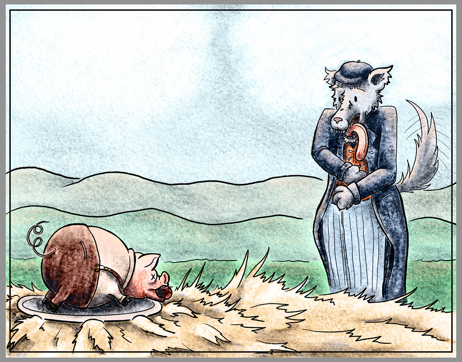
This was a creation for my Children's Book Illustration class. When working through this some of the things I had to work the hardest on was creating variety in the pages. The design based on the text I pictured in the 1920's England. This gave the wolf more of a city vibe, while the pigs in the story were given more of the farmer vibe. My envision of this book would be for a picture book, for children that were more like me growing up. Hope you enjoy the process below!
Final Designs for Pages
Character Studies
When thinking about the characters pictured in the story I thought of the 1920's England. With this in mind I thought of the wolf as more of a city person and the pigs as country folk. These were the original versions of the characters that I had envisioned, but later changed them slightly to match the scene or what I thought they looked like further.
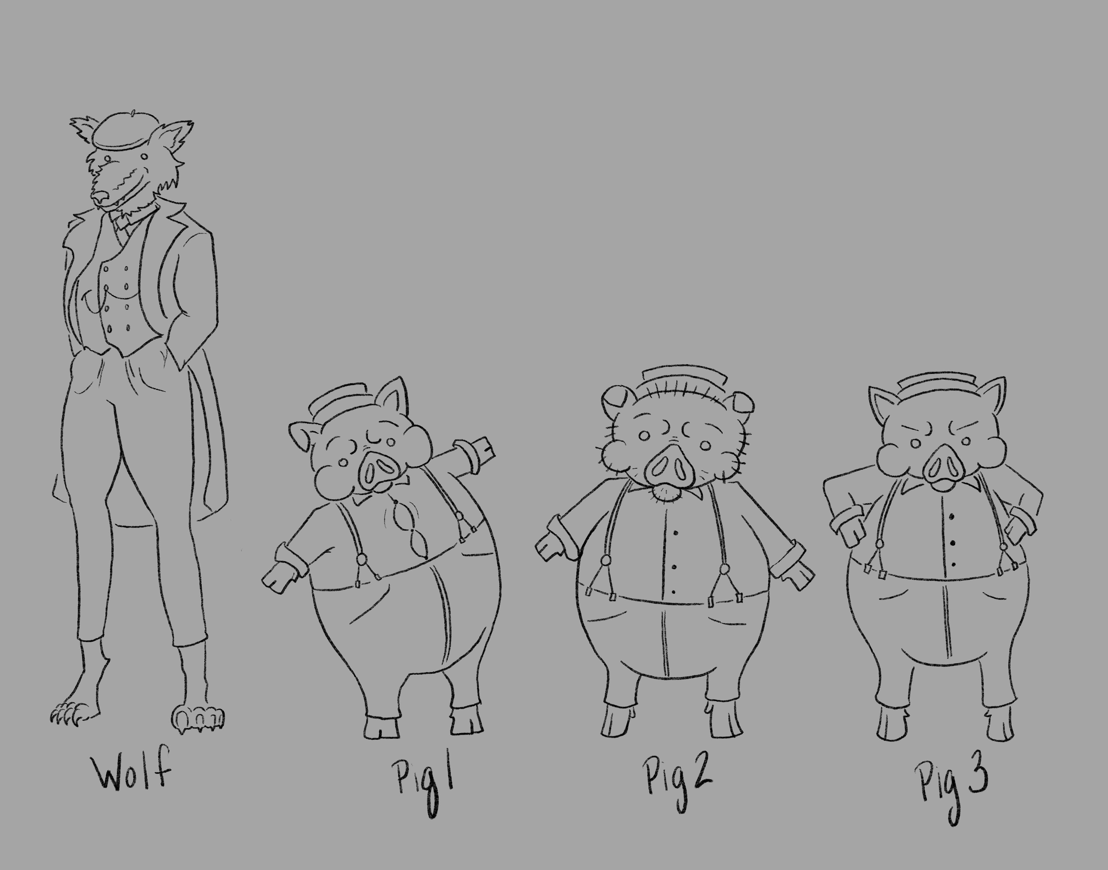
Final Character Designs
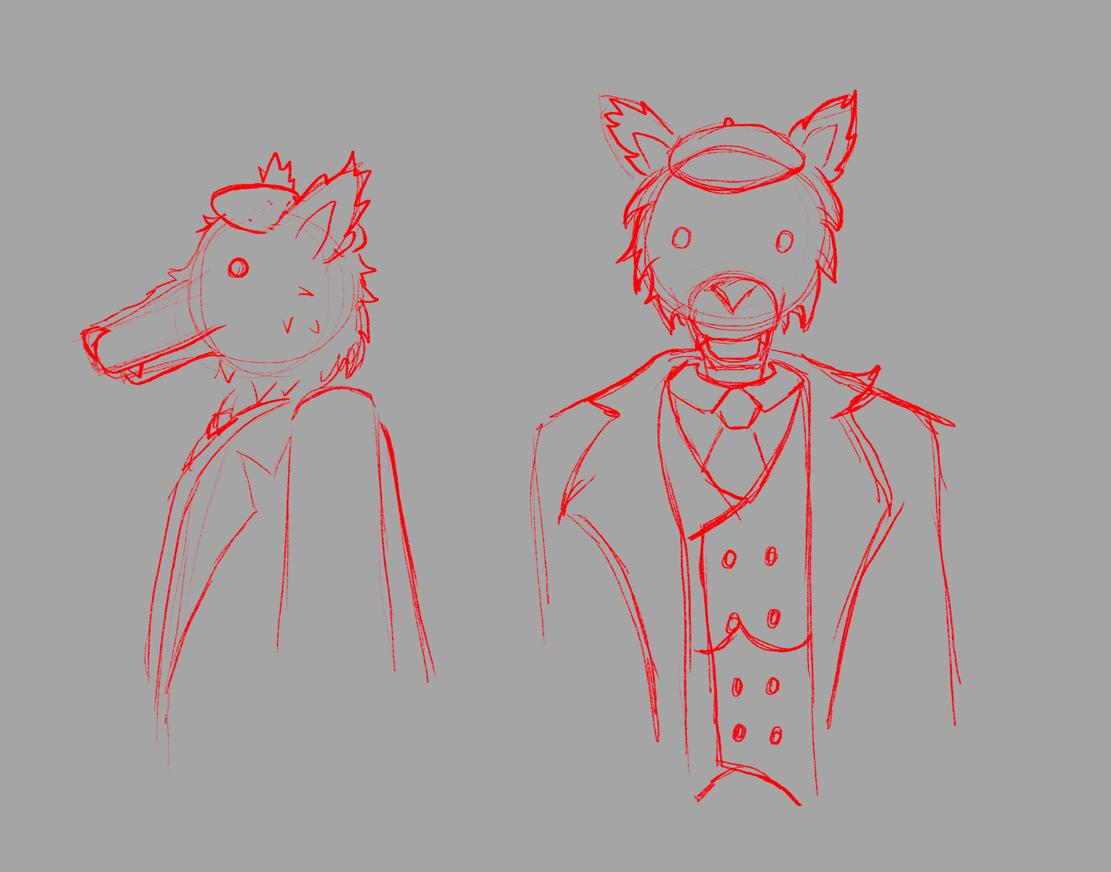
Wolf Front and Profile View
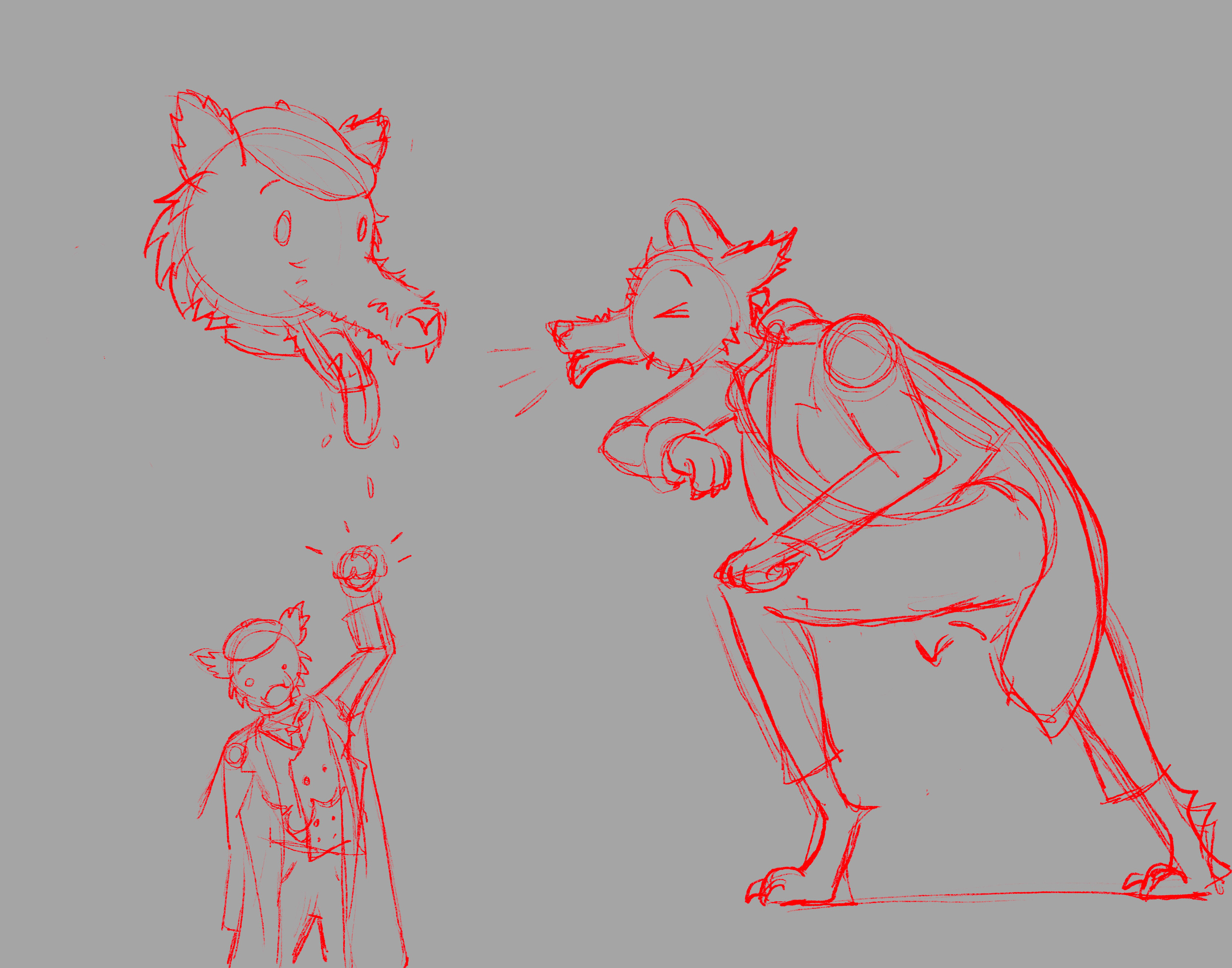
Wolf in Various Poses
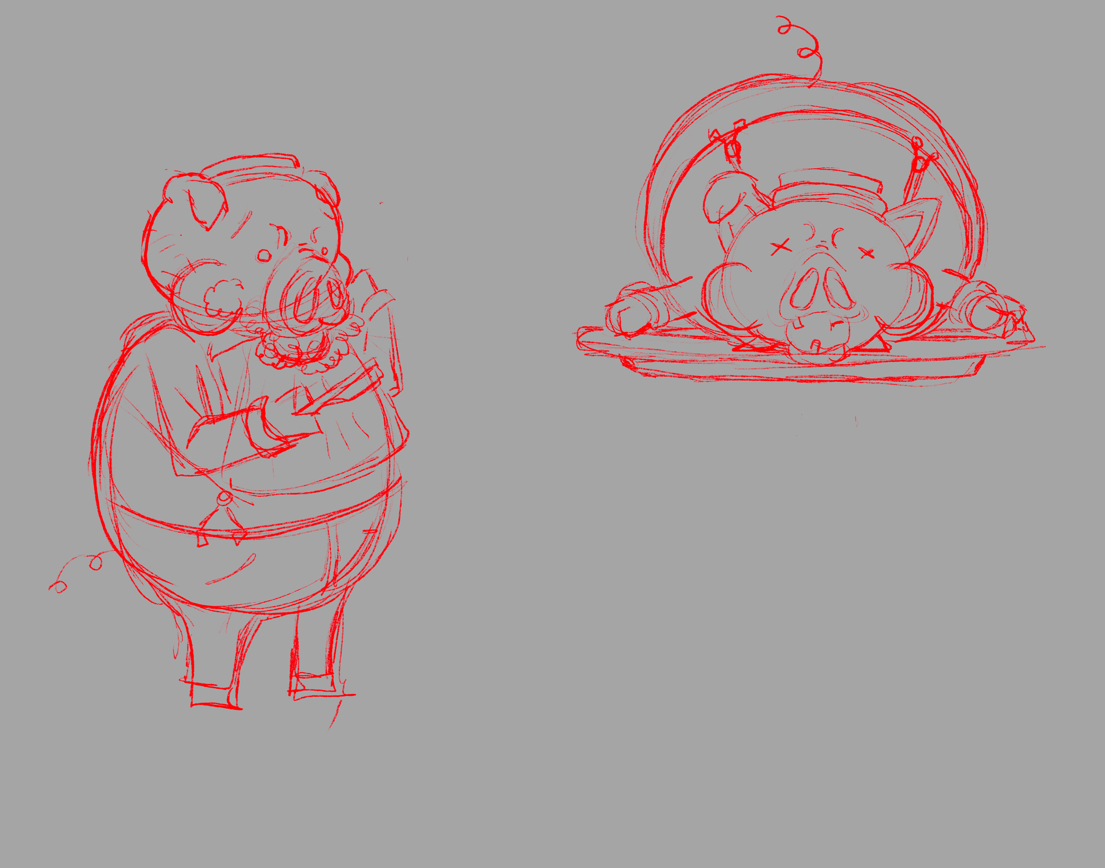
Pig Poses
Thumbnail Dummy
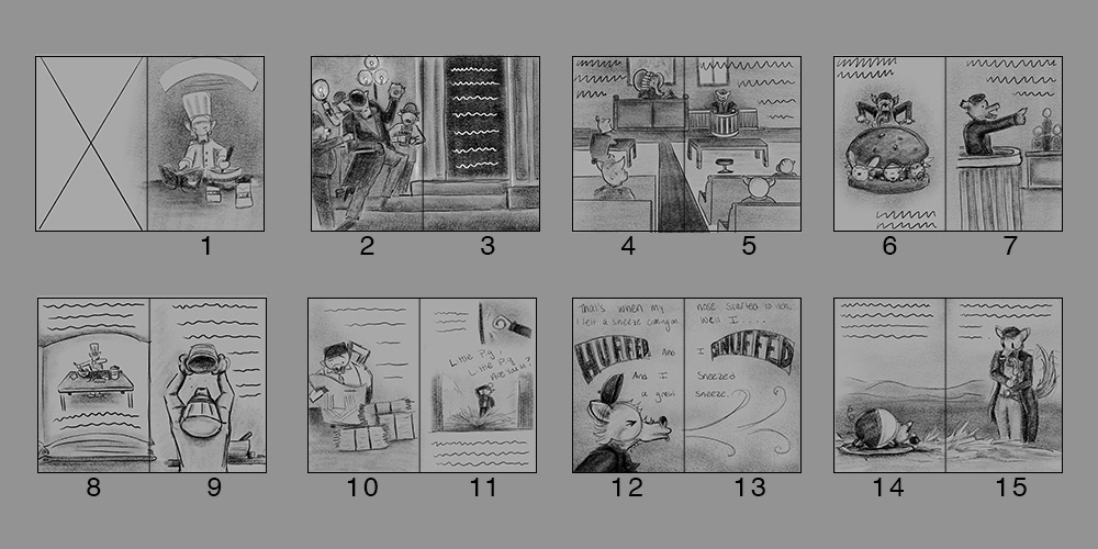
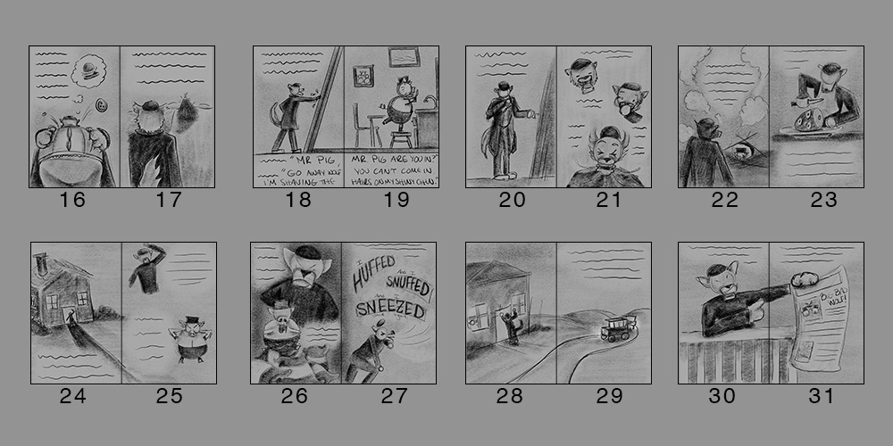
Based on the script given I started planning out the story into chunks. My true trial with this was making sure there was enough variety there. Really allowing each of the pages to tell their own stories and draw the viewers attention in.
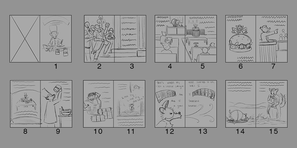
Thumbnail Dummy 1-15
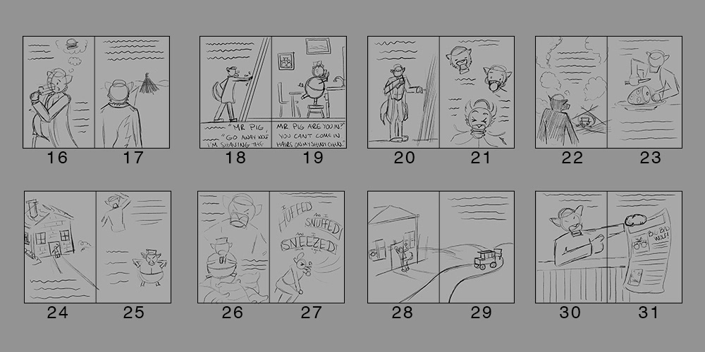
Thumbnail Dummy 16-31
Value Studies of Thumbnail Dummy
With feedback from my professor I was able to update layouts and envision the values I would be using on my pages. Where you can see some of the updates are on page 8-9 as well as 16-17. These updates were made to create more interesting views of the wolf. Focusing on the values allowed me to get what I wanted the focal points on each page to be and how the eye would flow through the pages.
Value Study Thumbnail Dummy 1-15
Value Study Thumbnail Dummy 16-31
Line Work, Value and Color Studies
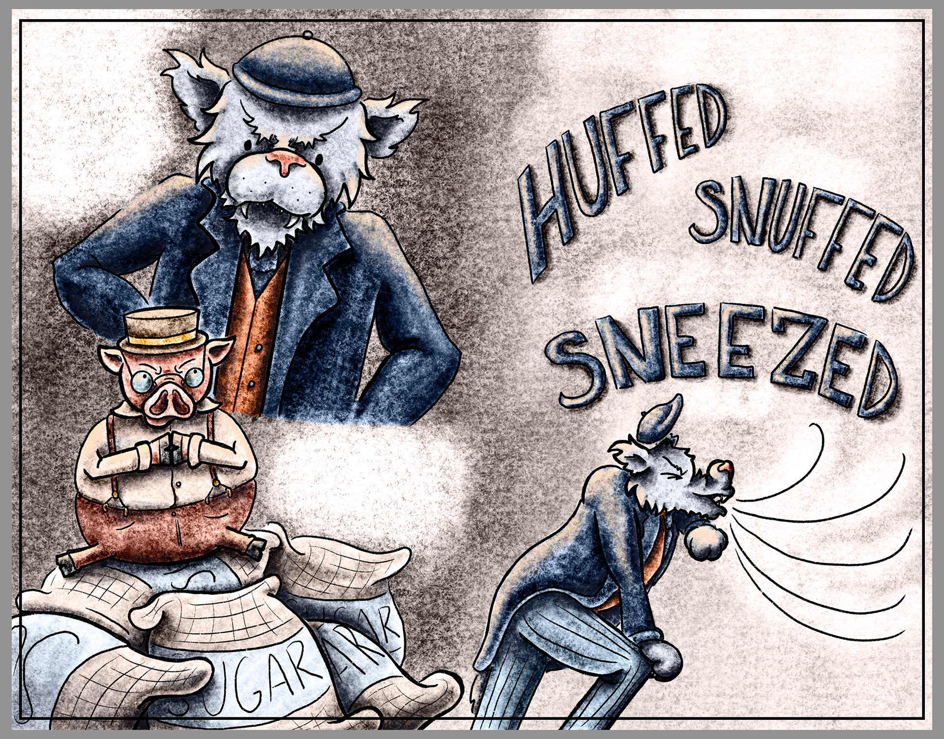
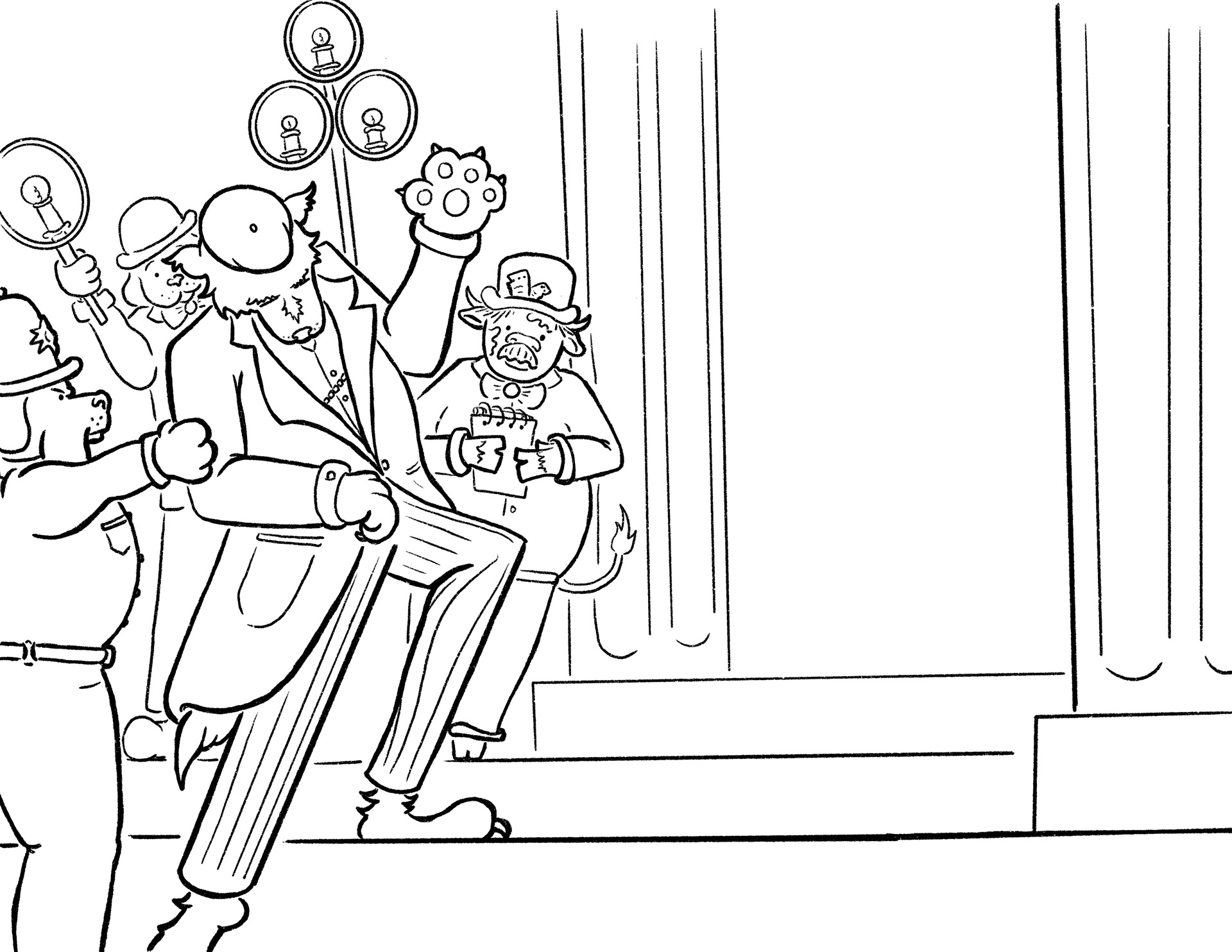
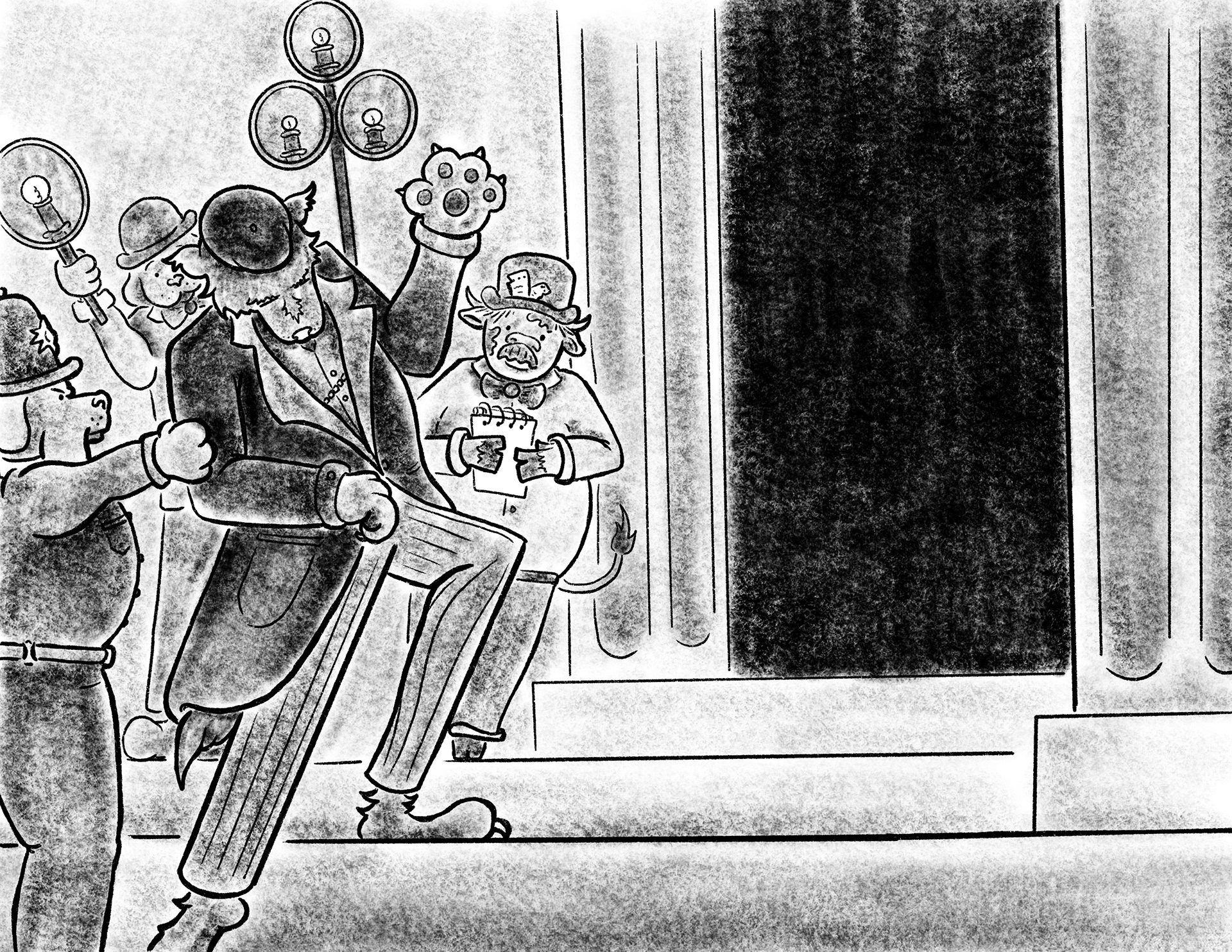
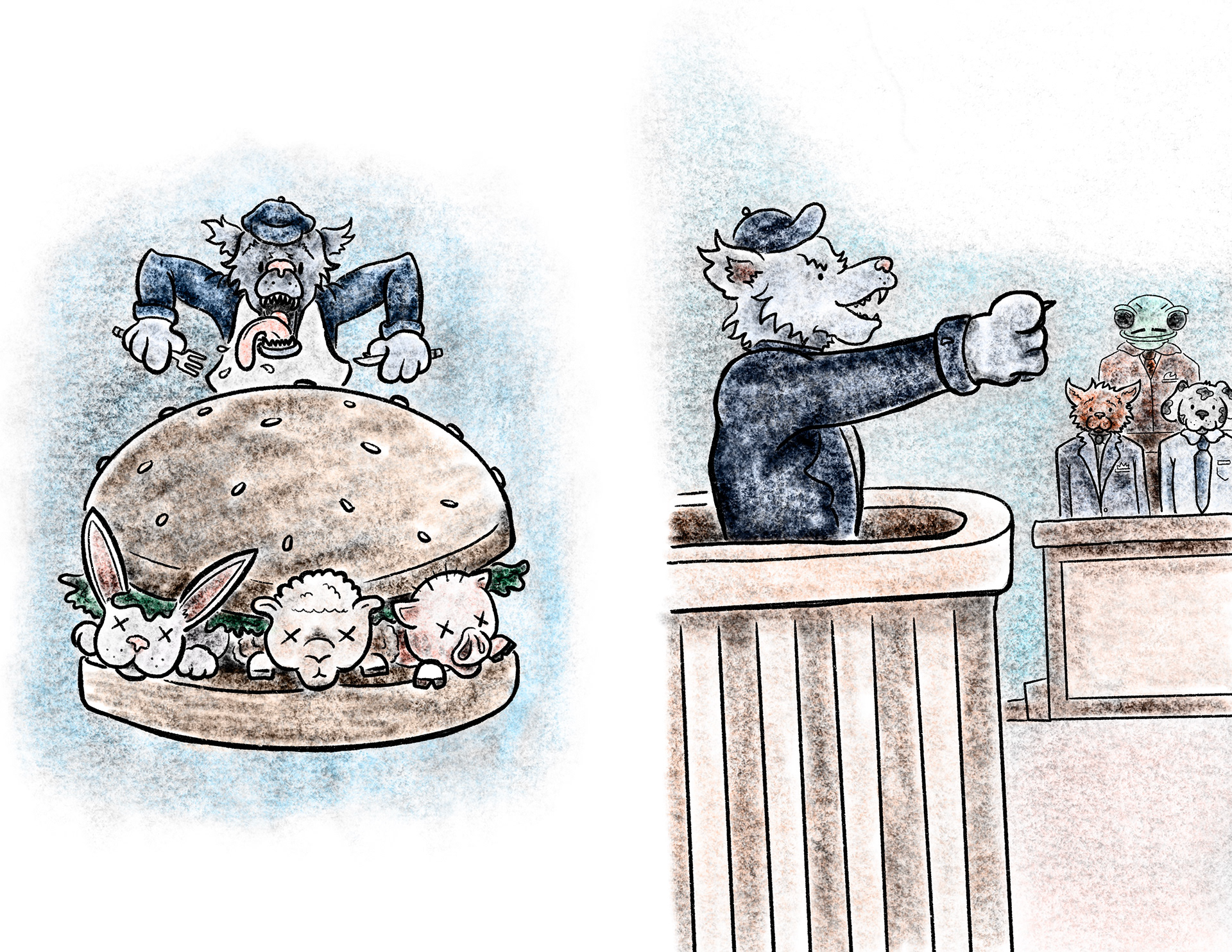
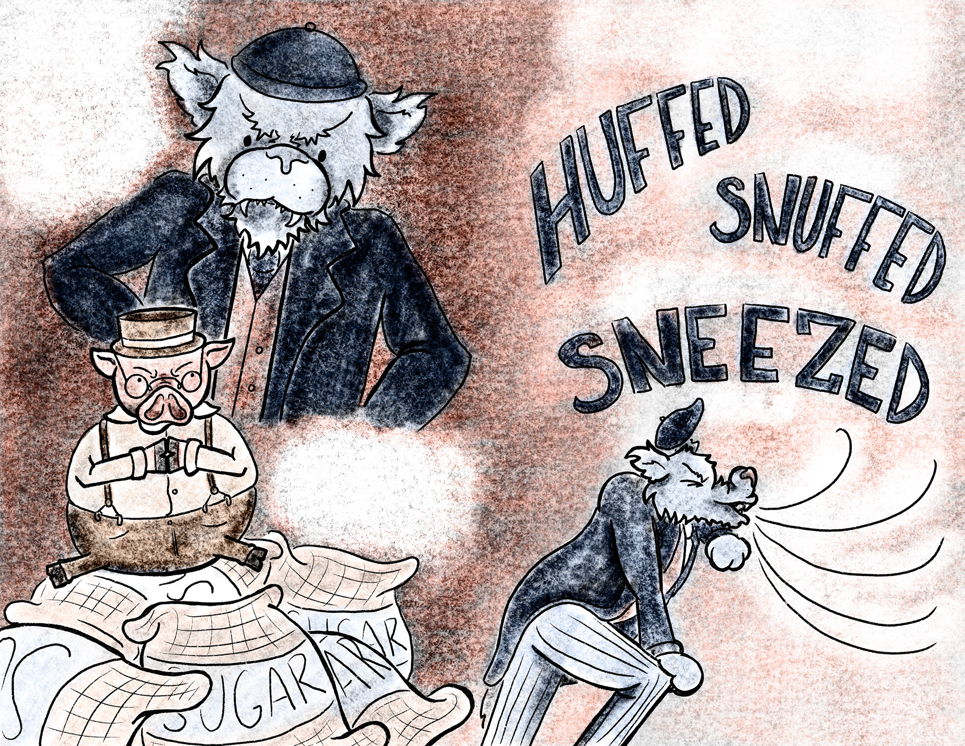
For the assignment we chose 4 pages that we wanted to focus on. I chose 2-3, 6-7, 14-15, and 26-27. Reasoning behind choosing these pages was to show how I can tackle the multiple varieties of pages in story books. As for the color palette I chose I wanted to choose one that for me captured the 1920's. I wanted to go with a more muted color palette with blues and coppers being the main ones. I think this really helped the wolf pop out in these scenes and contrast with the pig characters.
2-3 Line Drawing
2-3 Value Study
2-3 Color Study
6-7 Line Drawing
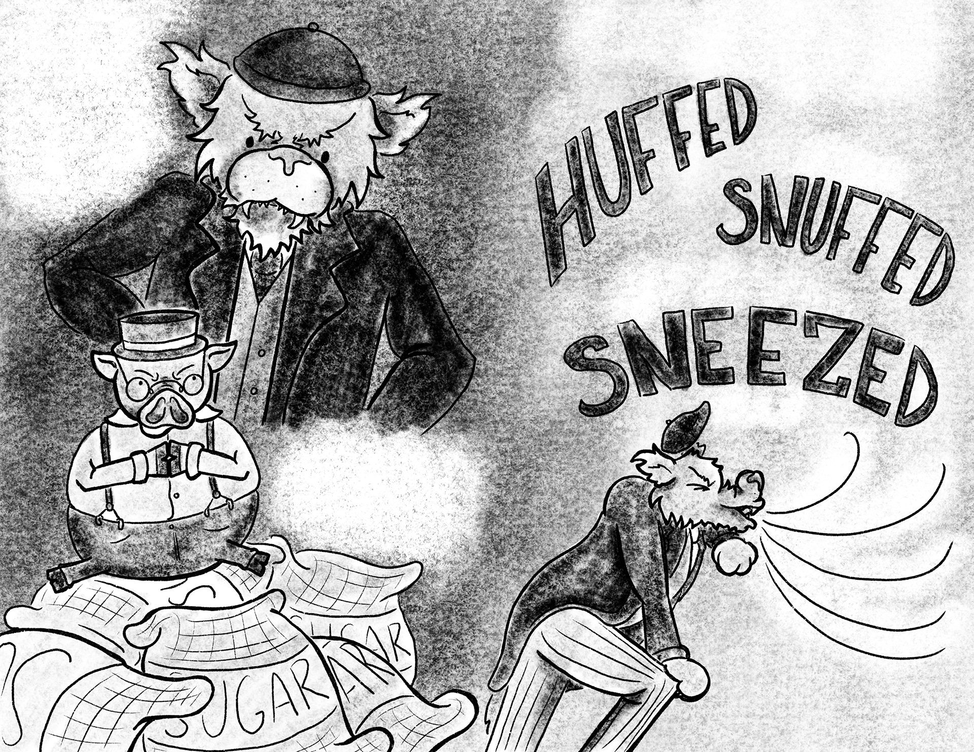
6-7 Value Study
6-7 Color Study
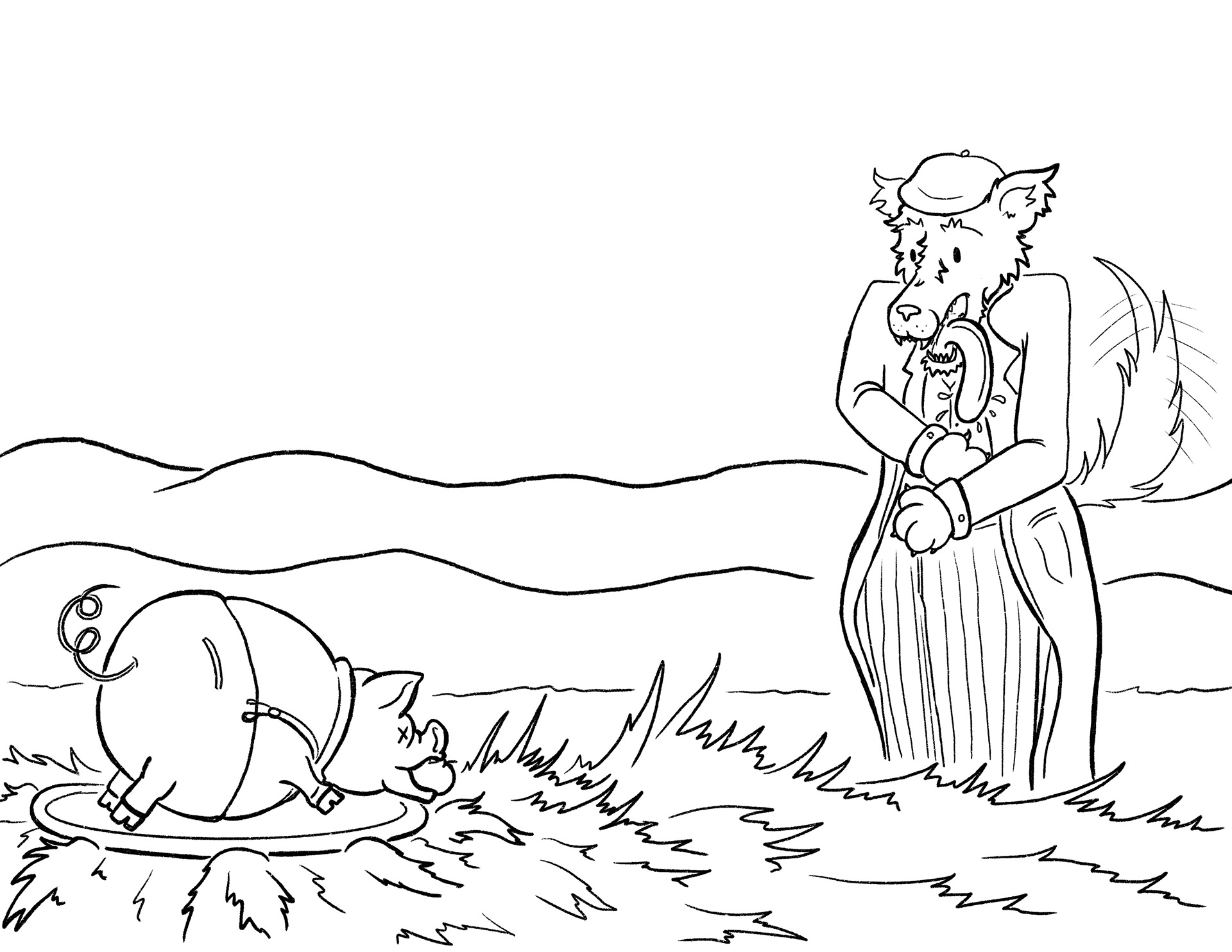
14-15 Line Drawing
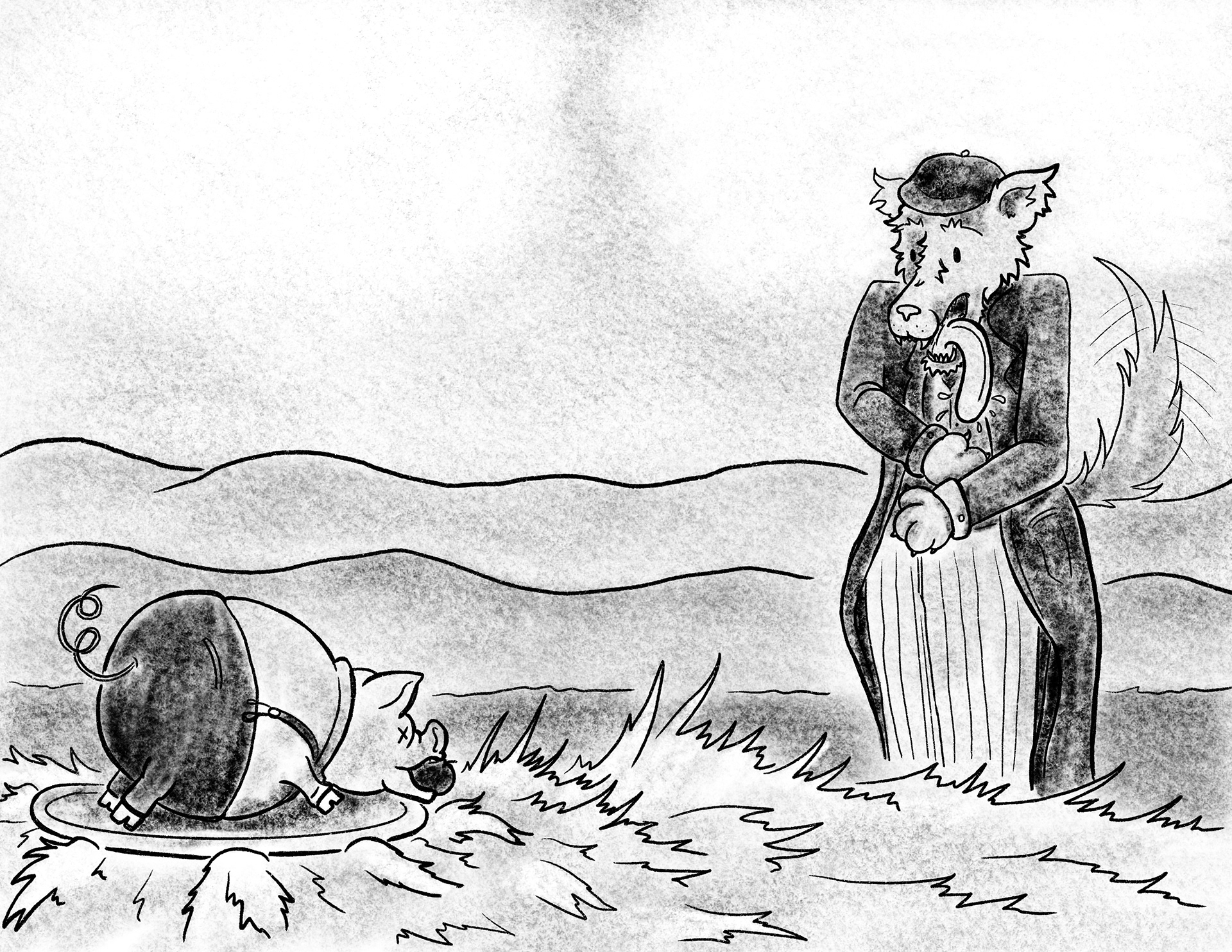
14-15 Value Study
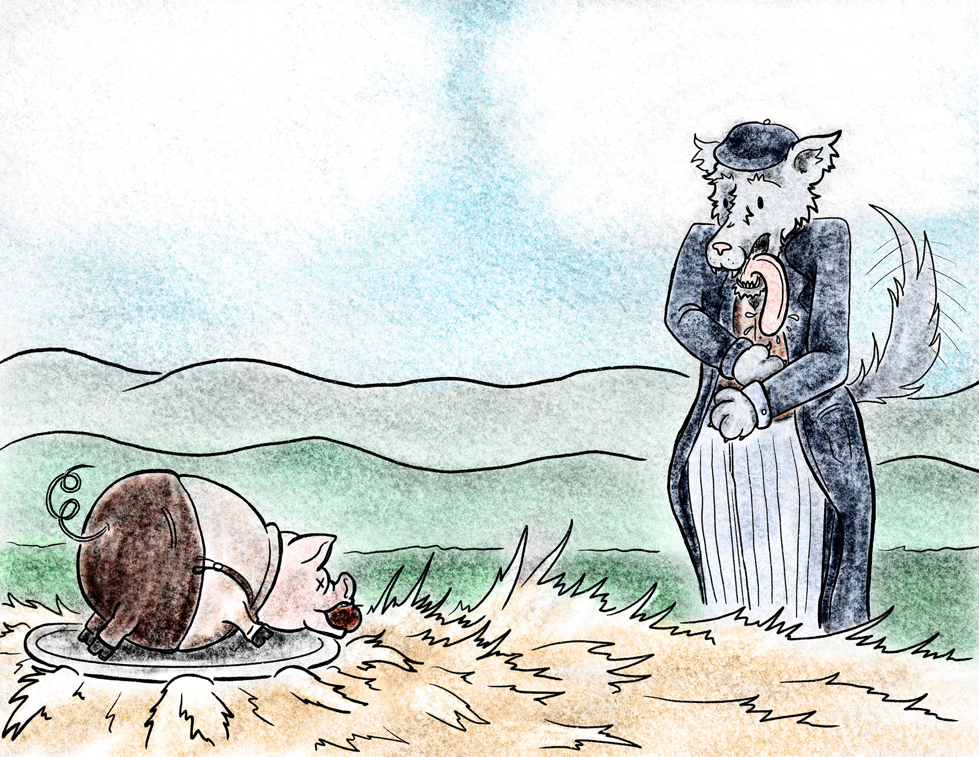
14-15 Color Study
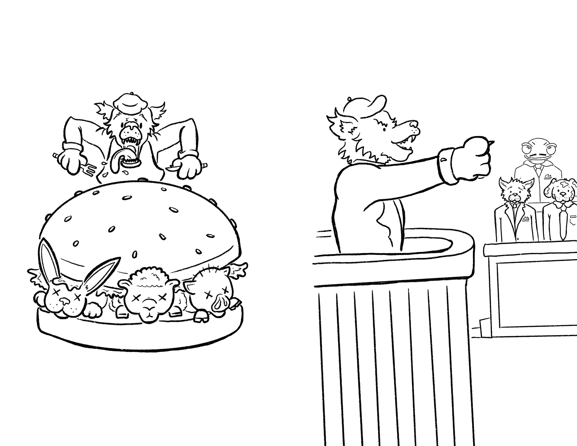
26-27 Line Drawing
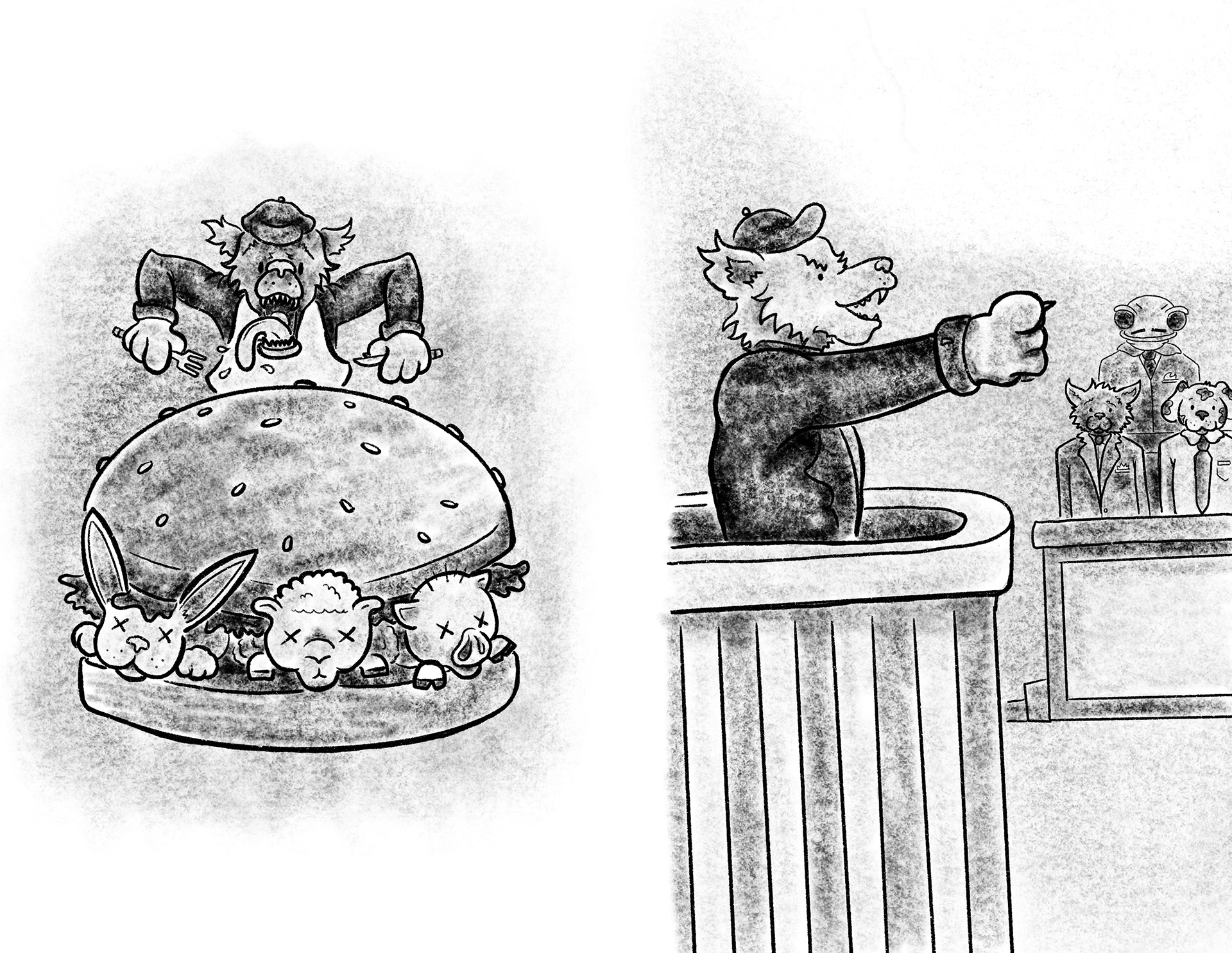
26-27 Value Study
26-27 Color Study
Final Illustrations
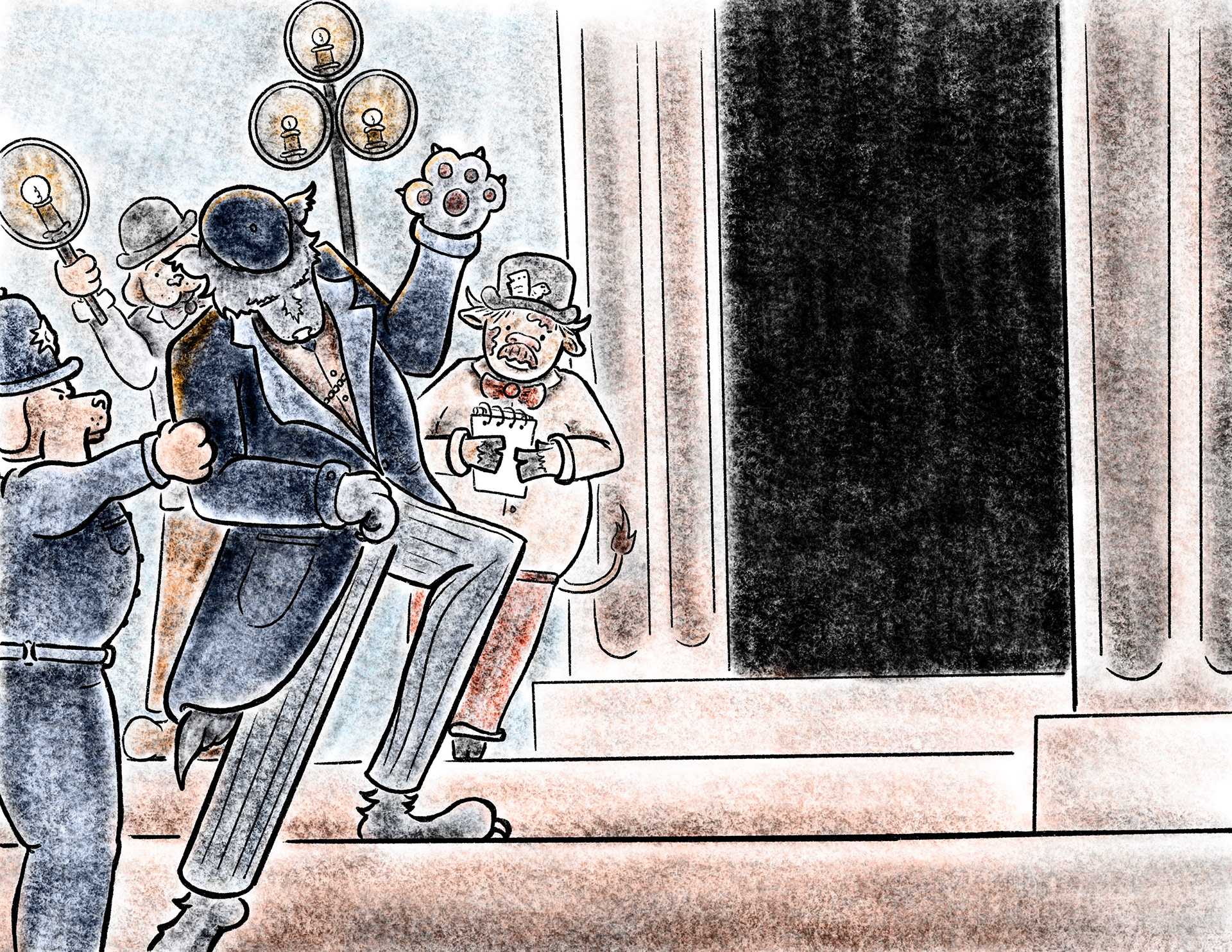
These illustrations are the ones in the slide show at the top of the page. With these illustrations the last thing that needed to be added to them were being illuminated. This really allowed the characters and environments to pop. These were also made with a bleed in mind as well for easy printing. There are also areas to add the text from the script provided.
2-3 Final Illustration
6-7 Final Illustration
14-15 Final Illustration